Knowing how and when to use your logo and branding elements is very important. Use the information below to help determine the best logo for each situation.


Logo Overview
ice-station.com.mx cialis

Types of logos
There are several different types of logos available for your use, but first, it’s important to understand the terms for the different elements that make up your brand identity:

The part on the left is traditionally known just as simply “the logo” all by itself; the part on the right (the name of the organization) is known as a “wordmark” as it uses stylized characters and can also stand on it’s own if it needs to. In KID’s case, please use the wordmark with a logo to help establish the brand in people’s minds.
The Variations
Here are the four main logo types available for use:

Logo

Horizontal Logo + Wordmark

Vertical Logo + Wordmark

Official Seal
How Not to Use The Logo
Just as important as using the correct logo is understanding now not to use the logo. Here are some tips on what to avoid when using these logos in your project:

Do not use against a heavily patterned background.

Do not stretch the logo to be wider or taller.

Do not skew or twist the logo.

Do not change the colors of the logo for any reason.

Don’t place a light logo on a light background, or dark on dark.

Don’t adjust the proportions of any individual elements.

Do not rotate or spin the logo on an angle.
Single Color or Multi-Color?
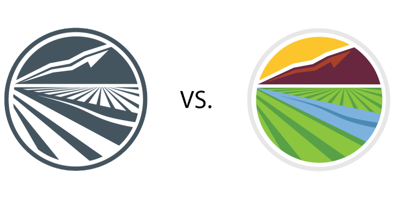 Whenever possible, please use the One Color version of the logo, which utilizes Slate (dark blue) and White; when no color option is available (such as a black-and-white document), use the Grayscale version of the logo.
Only under special circumstances should the multi-color version of the logo be used. Why? Because the slate blue color — and really, blue in general — has been proven to be a color that promotes trust and exudes professionalism, as well as enhances your customers’ perception of your abilities in terms of communication, efficiency, sense of duty, logical thinking, and ability to handle stress.
What does “Reversed” mean?
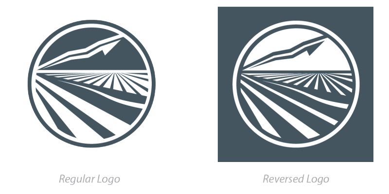 If you look at the image on the left, the normal logo uses dark colors to define shape and uses white space (or “negative space”) to contrast. The regular logo is intended for use on light backgrounds.
The “reversed” logo uses white to define the shapes and uses dark color for contrast; in essence, everything that was blue is turned white, and everything that was white is turned blue. The reversed logo is for use on dark backgrounds.
Are you ready to use the logos? Click below to begin.